

Efficient and user-friendly web forms are the unsung heroes of online workflows, serving as the essential gateway for capturing leads, processing transactions, and gathering valuable customer data.
This comprehensive guide explores expert strategies for optimizing web form data entry, providing actionable insights to streamline user interactions, enhance data accuracy, and significantly boost your website’s overall conversion performance.
The Critical Role of Web Form Data Entry in Digital Strategy
In the modern digital landscape, the interface where a user meets a blank field is a high-stakes moment. Whether you are managing B2B lead generation or simple newsletter signups, the friction within that interaction determines your success. Poorly optimized web form data entry is a silent killer of conversion rates.
Statistics suggest that nearly 26% of users will abandon a form if it feels overly complex. Furthermore, usability issues drive away 58% of potential completions. When we discuss web form data entry, we aren’t just talking about boxes on a screen; we are talking about the brand perception in marketing and the level of trust a customer places in your digital infrastructure.
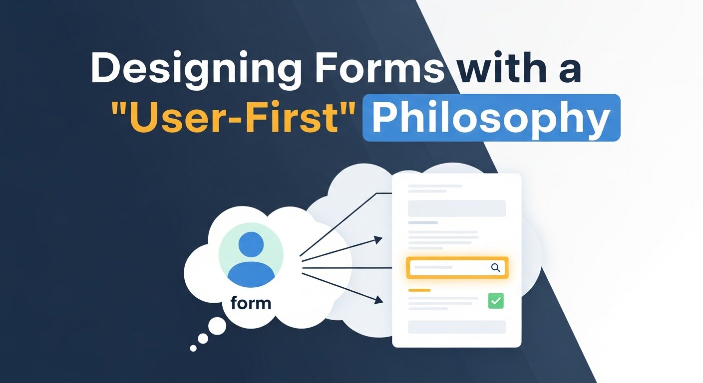
Designing Forms with a “User-First” Philosophy
Keep it Simple: The Power of Minimalist Input
When it comes to web form data entry, less is almost always more. Every additional field you add acts as a hurdle. To master inbound marketing, you must audit your forms to ensure you are only asking for “need-to-have” information.
- Audit your fields: If you don’t need a middle name or a fax number, remove them.
- Progressive Disclosure: For complex tasks like manual invoice data entry or high-level SaaS development services, use multi-step forms. This technique prevents “form fatigue” by showing only a few fields at a time.
Using Intuitive Field Labels
A user should never have to guess what belongs in a box. Clarity is the cornerstone of digital reputation management.
- Top-aligned labels: Research shows that labels placed above fields lead to faster completion times than left-aligned labels.
- Standard Naming: Use “Email Address” instead of cryptic terms. This also helps data entry automation software and browser autofill tools recognize the intent of the field.
Streamlining Interaction Through Automation
Leveraging Autofill and Browser Intelligence
Modern web form data entry relies heavily on browser capabilities. By using standard HTML attributes, you allow users to leverage saved data, which is a hallmark of automation for small businesses.
| Feature | Benefit for User | Benefit for Business |
| Autocomplete | Reduces typing effort by 70% | Higher completion rates |
| Input Masking | Guides the format (e.g., (555) 555-5555) | Higher data accuracy |
| Real-time Validation | Corrects errors instantly | Reduces server-side errors |
Real-Time Validation: The Feedback Loop
Don’t wait until the user hits “Submit” to tell them they missed an “@” symbol. Mastering real-time data validation ensures that the user feels supported. If a field is filled incorrectly, highlight it in red and provide a helpful hint immediately. This is a key component of customer journey mapping.
Advanced Technical Optimization

Automating Web Form Data Entry
For businesses handling high volumes of information, manual data entry is no longer sustainable. Implementing website data entry automation can save hundreds of hours. Tools like text expansion software or dedicated business process automation tools can bridge the gap between a web form and your internal systems.
- Automate Browser Data Entry: Use scripts or RPA (Robotic Process Automation) to port form submissions directly into your Hubspot data entry workflow or Automated CRM data entry systems.
- Integration with Finance: For eCommerce, ensuring automated data entry Xero or QuickBooks integration is active can streamline your manual invoice data entry tasks.
Mobile-Friendly Design
With mobile traffic dominating the web, your web form data entry must be “thumb-friendly.”
- Correct Keyboards: Use
type="tel"for phone numbers to trigger the numeric keypad. - Large Touch Targets: Ensure buttons are at least 44×44 pixels to avoid “fat-finger” errors.
- Responsive Layouts: The form should never require horizontal scrolling.
Building Trust and Security
Privacy and Data Ethics
In an era of ethical branding, transparency is your greatest asset. Users are hesitant to engage in web form data entry if they fear their data will be sold.
- Privacy Disclaimers: Include a short, human-readable sentence about data usage near the submit button.
- Security Badges: If you are a digital payment solution, displaying SSL certificates and security trust marks is non-negotiable for brand loyalty.
SSL and Encryption
Always serve your forms over HTTPS. This is not just an SEO requirement recognized by Ahrefs and SEMrush; it is a fundamental security standard. A “Not Secure” warning in a browser will kill your B2B lead generation efforts instantly.
Marketing and Brand Alignment
Brand Voice in Forms
Your form is an extension of your brand personality in marketing. If your brand is playful, your “Success” message should be too. If you are in luxury brand marketing, your form should be sleek, minimalist, and use high-end typography.
Using Forms for Content Marketing
Web forms are often the gateway to a content marketing plan. Whether it’s a webinar guide or a brand strategy framework, the form is where the exchange of value happens.
- Webinar Lead Generation Strategies: Use forms to segment your audience. Ask one question about their biggest challenge to tailor your follow-up emails.
- Psychology of Trend Marketing: Use “limited time” messaging near your form to leverage marketing FOMO (Fear Of Missing Out).
Testing, Analytics, and Optimization
A/B Testing Your Forms
You should never assume your first form design is the best. Use digital marketing analytics to run experiments.
- Test Button Copy: Does “Join Now” perform better than “Sign Up”?
- Test Form Length: Compare a single long page vs. a multi-step virtual event registration form.
- Mastering Video Analytics: If you have an explainer video next to your form, track how video views correlate with web form data entry completions.
Monitoring Drop-off Points
Use tools like Google Analytics or specialized marketing analytics tools to see exactly which field causes users to quit. If 40% of users leave when asked for a phone number, consider making that field optional to improve your conversion rate optimization.
The Future: AI and Intelligent Forms

The evolution of webinars and digital events has shown that users expect personalization. Artificial intelligence in business is now being used to create “smart forms” that change based on previous user behavior.
- Predictive Trend Marketing: AI can predict what a user is looking for and pre-fill fields.
- Ai-Driven Trend Forecasting: Use data from form submissions to identify emerging business trends before your competitors do.
- Sonic Branding: Some advanced forms even use subtle audio cues to confirm successful web form data entry, enhancing the sensory experience.
Comparative Analysis: Manual vs. Automated Data Entry
| Feature | Manual Data Entry | Automated Data Entry |
| Speed | Slow, prone to fatigue | Instantaneous |
| Accuracy | High human error risk | 99.9% Accurate |
| Scalability | Requires more staff | Scales with software |
| Cost | High (Labor costs) | Lower (Software subscription) |
| Example Tool | Virtual Assistant | Data Entry Automation Software |
Industry-Specific Form Strategies
B2B and Lead Generation
For B2B lead generation, quality often beats quantity. You might use more fields to disqualify “unqualified” leads. Integrating your forms with Salesforce webinars ensures that every lead is tracked through the webinar sales funnel.
Education and Webinars
If you are running webinars for education, your form should ask about the user’s current knowledge level. This allows for partnership marketing with video analytics to provide a more tailored learning experience. Don’t forget to include your webinar in resume if you are the host, as it builds personal authority.
E-commerce and Retail
In effective retail marketing analytics, the checkout form is the most important document. Use digital payment solutions that allow for “one-click” purchasing to bypass traditional web form data entry entirely.
Enhancing Accessibility
Inclusive design is part of ethical branding. Ensure your forms are accessible to everyone:
- Screen Reader Compatibility: Use proper ARIA labels so visually impaired users can navigate the web form data entry process.
- Keyboard Navigation: Users should be able to “Tab” through the entire form without using a mouse.
- Color Contrast: Ensure text is readable against the background, a key part of building brand consistency.
Mastering Psychology in Form Completion
Understanding the human brain is just as important as understanding code when it comes to web form data entry. By applying psychological principles, you can nudge users toward completion without them feeling pressured.
- The Sunk Cost Fallacy: In multi-step forms, once a user has invested time into the first two steps, they are statistically much more likely to finish the third. This is why virtual event registrations often start with the easiest questions (like “Name”) before asking for more sensitive data.
- The Goal Gradient Effect: Users speed up as they get closer to the finish line. Always include a progress bar. Seeing “80% Complete” triggers a dopamine hit that encourages the user to cross the finish line.
- Cognitive Load Reduction: Group related fields together. For example, keep “Street,” “City,” and “Zip Code” in one visual block. This allows the brain to process the information as one “task” rather than three separate ones, a vital tactic in manual invoice data entry systems.
Advanced Data Sanitization and Error Handling

High-quality web form data entry isn’t just about getting the user to type; it’s about ensuring the data that reaches your database is clean and usable. This is where mastering real-time data becomes technical.
- Inline Validation vs. After-Submission: Never wait for a page reload to show an error. Use JavaScript to validate the format of an email or the length of a password as soon as the user moves to the next field.
- Forgiving Formats: Don’t punish users for how they type. Your system should be smart enough to strip out dashes in phone numbers or spaces in credit card fields. This “backend” data entry automation software logic makes the user feel like the form is working with them, not against them.
- Dynamic Help Text: Use “micro-copy” that changes based on the user’s action. If they hover over a “CVV” field, show a small image of where to find that number on a card. This is essential for digital payment solutions.
Localizing Forms for Global Markets
If your brand has a global reach, a one-size-fits-all approach to web form data entry will fail. Brand adaptation strategies require you to respect regional differences in data formatting.
| Data Type | Regional Variation | Strategy for Form |
| Names | Some cultures put the surname first. | Use a single “Full Name” field instead of First/Last. |
| Addresses | UK Postcodes vs. US Zip Codes. | Use dynamic address lookups based on country selection. |
| Phone Numbers | Varying lengths and country codes. | Use a dropdown with flags to auto-set the prefix. |
Conclusion
Mastering web form data entry is not just a technical task; it is a strategic imperative. By combining intuitive design, real-time validation, and powerful business process automation tools, you transform a mundane task into a seamless user journey. Focus on building trust through transparency and constant optimization via marketing analytics. When you prioritize the user’s time and effort, your conversion rates—and your brand authority—will inevitably rise.
Frequently Asked Questions
1. What is the most important factor in web form data entry?
The most critical factor is usability. If a user finds the form difficult to navigate or time-consuming, they will abandon it regardless of how good the offer is. Keeping fields to a minimum and using clear labels are the best ways to ensure a positive experience.
2. How can I reduce form abandonment?
To reduce abandonment, minimize the number of required fields, use real-time validation to prevent errors, and ensure the form is fully responsive for mobile users. Implementing a progress bar for longer forms also helps set expectations.
3. Should I use “Clear” or “Reset” buttons?
Generally, no. Reset buttons often lead to accidental data loss, frustrating users who might have clicked them by mistake. It is better to allow users to manually edit fields or provide a “Cancel” option that takes them back to the previous page.
4. Is it better to have one long form or multiple steps?
For forms with more than 5-7 fields, a multi-step approach is usually better. It reduces cognitive load and makes the process feel more manageable. This is a common strategy in virtual event registrations and complex SaaS development services.
5. What are the benefits of data entry automation software?
Data entry automation software reduces human error, speeds up processing times, and allows your team to focus on higher-level tasks. It is essential for scaling operations like manual invoice data entry or high-volume B2B lead generation.
6. How do I make my forms mobile-friendly?
Use large input fields, ensure buttons are easily clickable with a thumb, and use HTML5 input types to trigger the correct mobile keyboard (e.g., numeric for zip codes). Avoid multi-column layouts on mobile screens.
7. How does real-time validation improve SEO and UX?
While it doesn’t directly affect search rankings, real-time validation improves UX, which reduces bounce rates—a signal search engines like Backlinko suggest can indirectly impact your SEO. It ensures high-quality data collection.
8. What is “Progressive Disclosure” in web forms?
Progressive disclosure is a design technique where you only show the most relevant information or fields first. Additional fields are revealed only if necessary (e.g., showing “Company Name” only if the user selects “Business” as their account type).
9. How can I build trust with my online forms?
Display SSL certificates, provide clear privacy disclaimers, and use brand voice strategy to remain consistent. Transparency about how you use the data collected via web form data entry is key to maintaining digital reputation management.
10. Can AI improve my web forms?
Yes, AI can be used for predictive trend marketing, pre-filling fields based on user behavior, and even using chatbots to guide users through a conversational form experience, which often sees higher engagement than traditional layouts.


